Automated Data Plotter
This application dynamically generates many types of graphs derived from various IEM data sources. Feel free to use these generated graphics in whatever way you wish.
1 Select a Chart Type
2 Configure Chart Options
Plot Description:
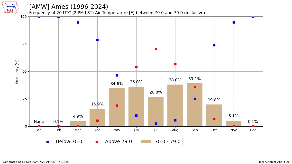
This plot presents the frequency of a given hourly variable being between two inclusive thresholds. The hour is specified in UTC (Coordinated Universal Time) and observations are rounded forward in time such that an observation at :54 after the hour is moved to the top of the hour. This autoplot attempts to consider only one observation per hour.3 Generated Chart
Based on recent timings, plot generation averages 8 seconds. Please wait while your chart is being generated...
If you notice plotting issues with the image above, please
contact us
and provide the URL address currently shown by your web browser.
IEM Daily Features using this plot
The IEM Daily Features found on this website often utilize plots found on this application. Here is a listing of features referencing this plot type.
- 08 May 2026: Afternoon mid-60s
- 08 Aug 2024: Afternoon 70s
- 13 May 2022: May 90s
- 13 Oct 2020: Enjoy the 70s
- 04 May 2020: Lovely 70s
- 26 Oct 2018: Afternoon 50s
- 22 Feb 2017: Comparing 60s to July
- 14 Apr 2016: Lower 70s in April
- 08 Jul 2015: 70s in July
- 02 Jun 2015: 3PM 70s in June
- 13 Mar 2015: 70s at 4 PM
- 17 Oct 2014: In the 70s