Automated Data Plotter
This application dynamically generates many types of graphs derived from various IEM data sources. Feel free to use these generated graphics in whatever way you wish.
1 Select a Chart Type
2 Configure Chart Options
Plot Description:
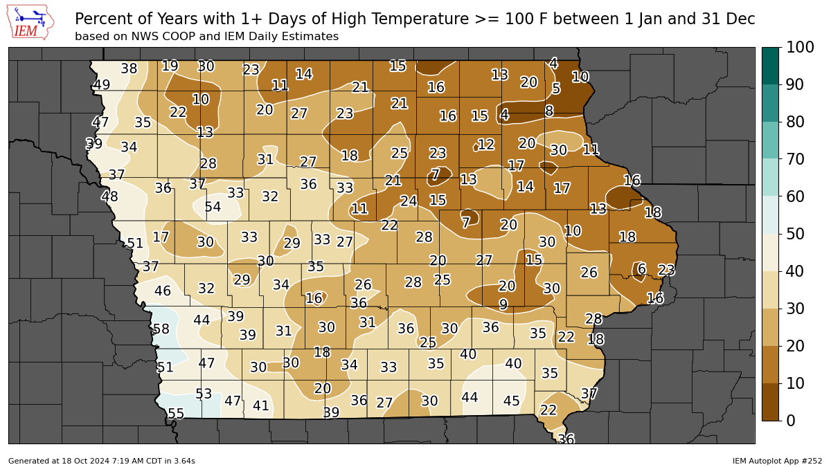
This autoplot generates a map of the frequency of having at least one day at-or-above or below a given threshold between an inclusive period of days.If you set the start date to a date greater than the end date, the effect is to search the period including 1 January.
3 Generated Chart
Based on recent timings, plot generation averages 5 seconds. Please wait while your chart is being generated...
If you notice plotting issues with the image above, please
contact us
and provide the URL address currently shown by your web browser.
IEM Daily Features using this plot
The IEM Daily Features found on this website often utilize plots found on this application. Here is a listing of features referencing this plot type.
- 07 Nov 2025: November Measurable Snowfall
- 12 Sep 2025: 90s yet this September
- 17 Jul 2025: Mid-July Highs below 75
- 10 Apr 2024: Frequency of below 20