IEM Daily Feature
Tuesday, 14 April 2020
Tuesday, 14 April 2020
Up and to the Right
Posted: 14 Apr 2020 04:44 AM
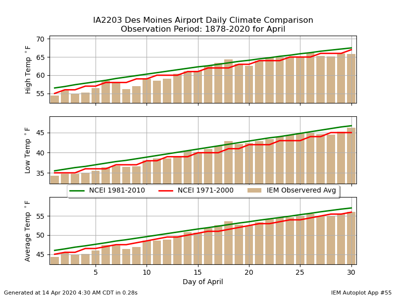
With temperatures struggling this week well below climatology, it is a good time to check in on what
climatology is for this time of year. The featured chart presents a comparison between three
climatologies. The NWS official one is currently the green line which represents the thirty year period
between 1981 and 2010. The red line was the previous official climatology representing the previous
30 year period. Its values were whole degree, so that is why it is choppier than the other two plotted
values. The bars represent the arithmetic average based on period of record data. It is interesting to
notice small differences between the three lines. The official climatology is smoothed to remove
noisey day to day variability present over just a 30 year sampling period. Regardless of all the above,
we should be much warmer today with highs closer to 60 degrees than 40!
Voting:
Good = 9
Bad = 1
Tags: climatology
Voting:
Good = 9
Bad = 1
Tags: climatology

