IEM Daily Feature
Thursday, 10 October 2013
Thursday, 10 October 2013
Hovmoller Fun
Posted: 10 Oct 2013 05:39 AM
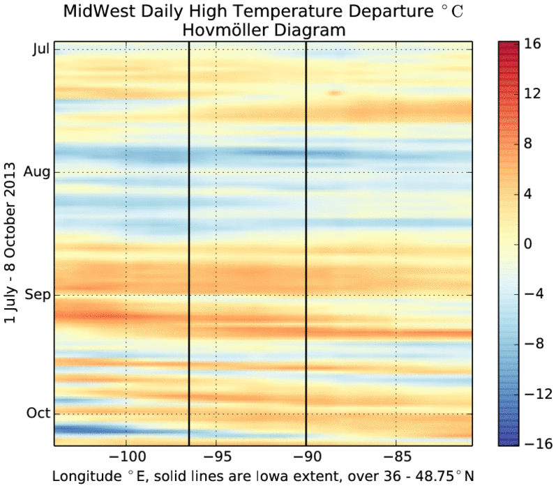
The featured chart is a called a Hovmoller Diagram. It displays the
time evolution of some averaged field. In this case, each row
represents the meridonal (north-south) average daily high temperature
departure for the midwestern US. Time increases as you go down the
chart. The two vertical lines represent the areal average that
includes Iowa. Values on the left are to the west of Iowa and likewise
values on the right are to the east of Iowa. A neat aspect of this
chart is that you can visually see the movement and modulation of air
masses. For example in September, you can see movement from upper left
to lower right. This represents air masses going from the western part
of the domain to the eastern part, with the slope representing the
speed of movement. The plot also shows a difference during the summer
months to what has happened since early September. The difference is
due to having storm tracks every week or so as opposed to persistent
air masses during the lazy days of summer. The very dark blues (cold
departures) showing up in October are where the snow fell in western
Nebraska and South Dakota.
Voting:
Good = 38
Bad = 7
Tags: hovmoller
Voting:
Good = 38
Bad = 7
Tags: hovmoller